Table of Contents
In the ever-evolving world of web development, creating engaging and interactive user interfaces has become paramount. As React.js continues to dominate the frontend landscape, developers are constantly seeking ways to elevate their applications with smooth, eye-catching animations. This is where velocity libraries come into play, offering a powerful toolkit for implementing fluid and performant animations in React applications. In this comprehensive guide, we’ll explore the world of velocity libraries for animation in React.js, diving deep into their benefits, popular options, and practical implementation techniques.
Introduction to Velocity Libraries in React.js

Velocity libraries are specialized tools designed to simplify the process of creating smooth, efficient animations in web applications. In the context of React.js, these libraries provide developers with a set of components, hooks, and utilities that seamlessly integrate with React’s component-based architecture. By leveraging velocity libraries, developers can bring their user interfaces to life with minimal effort and maximum performance.
The term “velocity” in this context refers to the speed and direction of movement in animations. Velocity libraries excel at handling these aspects, allowing for precise control over the timing, easing, and physics of animated elements. This level of control enables developers to create animations that feel natural and responsive, enhancing the overall user experience of React applications.
Why Use Velocity Libraries for Animation?
Before we dive into specific libraries and implementation details, it’s crucial to understand the benefits of using velocity libraries for animation in React.js:
- Performance Optimization: Velocity libraries are built with performance in mind. They often use requestAnimationFrame and other optimizations to ensure smooth animations, even on lower-end devices.
- Declarative Syntax: Many velocity libraries offer a declarative API that aligns well with React’s philosophy. This makes it easier to describe complex animations in a clear and maintainable way.
- Physics-Based Animations: Some libraries provide physics engines that allow for realistic motion, including spring animations and fluid transitions.
- Cross-Browser Compatibility: Velocity libraries abstract away browser differences, ensuring consistent animation behavior across various platforms and devices.
- Reduced Boilerplate: Instead of manually managing animation states and transitions, developers can leverage pre-built components and hooks, significantly reducing the amount of code needed.
- Integration with React’s Lifecycle: These libraries are designed to work seamlessly with React’s component lifecycle, ensuring proper cleanup and preventing memory leaks.
By incorporating velocity libraries into your React projects, you can create more engaging user interfaces while maintaining clean, efficient code.
Popular Velocity Libraries for React.js
The React ecosystem offers several excellent libraries for animation. Let’s explore some of the most popular options:
- React-Spring: A spring-physics based animation library that brings your components to life with simple, yet powerful animations.
- Framer Motion: A production-ready motion library for React that makes creating animations intuitive and straightforward.
- Velocity.js: While not React-specific, Velocity.js is a powerful animation engine that can be easily integrated into React applications.
- React-Motion: A spring-based animation library that focuses on creating realistic, physics-based animations.
- Anime.js: A lightweight JavaScript animation library that works well with React and offers a wide range of animation capabilities.
In the following sections, we’ll take a closer look at implementing animations using some of these popular libraries.
Getting Started with React-Spring

React-Spring is a highly regarded animation library in the React community, known for its spring-physics based animations and hooks-first API. Let’s explore how to get started with React-Spring in your React application.
First, install React-Spring in your project:
npm install react-springNow, let’s create a simple fade-in animation for a component:
import React from 'react';
import { useSpring, animated } from 'react-spring';

const FadeInComponent = () => {
  const props = useSpring({
    opacity: 1,
    from: { opacity: 0 },
    config: { duration: 1000 }
  });

  return (
    <animated.div style={props}>
      <h1>Welcome to my animated component!</h1>
    </animated.div>
  );
};

export default FadeInComponent;
In this example, we use the useSpring hook to define our animation properties. The component starts with an opacity of 0 and animates to an opacity of 1 over a duration of 1000 milliseconds.
React-Spring also allows for more complex animations. Here’s an example of a button that scales up on hover:
import React from 'react';
import { useSpring, animated } from 'react-spring';

const AnimatedButton = () => {
  const [props, set] = useSpring(() => ({
    scale: 1,
    config: { mass: 1, tension: 180, friction: 12 }
  }));

  return (
    <animated.button
      style={{
        transform: props.scale.interpolate(s => `scale(${s})`)
      }}
      onMouseEnter={() => set({ scale: 1.1 })}
      onMouseLeave={() => set({ scale: 1 })}
    >
      Hover me!
    </animated.button>
  );
};

export default AnimatedButton;
This button uses spring physics to create a natural, bouncy scaling effect on hover. The config object allows fine-tuning of the spring behavior.
Animating with Framer Motion

Framer Motion is another popular choice for animations in React, offering an intuitive API and powerful features. Let’s see how to use Framer Motion to create smooth animations.
First, install Framer Motion:
npm install framer-motionNow, let’s create a simple fade-in animation similar to our React-Spring example:
import React from 'react';
import { motion } from 'framer-motion';

const FadeInComponent = () => {
  return (
    <motion.div
      initial={{ opacity: 0 }}
      animate={{ opacity: 1 }}
      transition={{ duration: 1 }}
    >
      <h1>Welcome to my animated component!</h1>
    </motion.div>
  );
};

export default FadeInComponent;
Framer Motion uses a declarative approach, where you specify the initial and final states of your animation directly on the component.
Let’s create a more complex animation, such as a staggered list reveal:
import React from 'react';
import { motion } from 'framer-motion';

const StaggeredList = () => {
  const items = ['Item 1', 'Item 2', 'Item 3', 'Item 4'];

  const containerVariants = {
    hidden: { opacity: 0 },
    visible: {
      opacity: 1,
      transition: {
        delayChildren: 0.3,
        staggerChildren: 0.2
      }
    }
  };

  const itemVariants = {
    hidden: { y: 20, opacity: 0 },
    visible: {
      y: 0,
      opacity: 1
    }
  };

  return (
    <motion.ul
      variants={containerVariants}
      initial="hidden"
      animate="visible"
    >
      {items.map((item, index) => (
        <motion.li key={index} variants={itemVariants}>
          {item}
        </motion.li>
      ))}
    </motion.ul>
  );
};

export default StaggeredList;
This example demonstrates Framer Motion’s powerful variants feature, which allows you to define reusable animation states and propagate them through the component tree.
Leveraging Velocity.js in React

While not specifically designed for React, Velocity.js is a powerful animation engine that can be effectively used in React applications. Let’s explore how to integrate Velocity.js into a React component.
First, install library:
npm install velocity-animateNow, let’s create a component with a Velocity.js animation:
import React, { useEffect, useRef } from 'react';
import Velocity from 'velocity-animate';

const VelocityComponent = () => {
  const elementRef = useRef(null);

  useEffect(() => {
    Velocity(elementRef.current, { opacity: 1, translateY: 0 }, {
      duration: 1000,
      easing: 'easeOutExpo',
      delay: 500
    });
  }, []);

  return (
    <div ref={elementRef} style={{ opacity: 0, transform: 'translateY(50px)' }}>
      <h1>Animated with Velocity.js!</h1>
    </div>
  );
};

export default VelocityComponent;
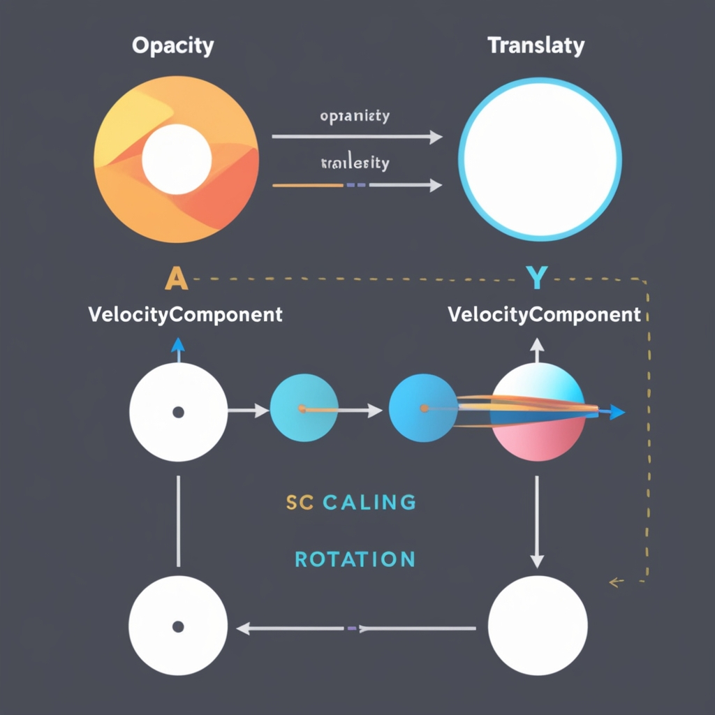
In this example, we use the useRef hook to get a reference to our DOM element, and then use Velocity.js in a useEffect hook to animate the element once it’s mounted.
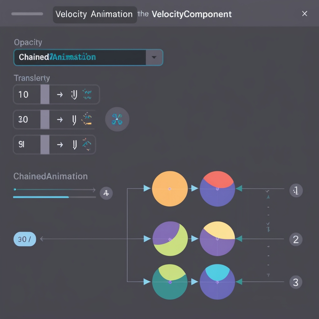
This is particularly useful for complex animations that require fine-grained control over easing and timing. Here’s an example of chained animations using Velocity.js:
import React, { useEffect, useRef } from 'react';
import Velocity from 'velocity-animate';

const ChainedAnimation = () => {
  const elementRef = useRef(null);

  useEffect(() => {
    const element = elementRef.current;
    Velocity(element, { scale: 1.5 }, { duration: 500 })
      .then(() => {
        return Velocity(element, { rotateZ: 180 }, { duration: 500 });
      })
      .then(() => {
        return Velocity(element, { scale: 1, rotateZ: 360 }, { duration: 500 });
      });
  }, []);

  return (
    <div ref={elementRef} style={{ display: 'inline-block' }}>
      <h2>Chained Animations</h2>
    </div>
  );
};

export default ChainedAnimation;
This component demonstrates how to chain multiple animations together, creating a sequence of scaling and rotation effects.
Advanced Techniques and Best Practices
As you become more comfortable with velocity libraries in React, you can start exploring more advanced techniques to create truly stunning animations. Here are some best practices and advanced concepts to consider:
- Use Gesture-Based Animations: Many velocity libraries offer integration with gesture libraries like
react-use-gesture. This allows you to create animations that respond to user input, such as dragging or swiping. - Implement Shared Element Transitions: Create smooth transitions between different views by animating shared elements. This technique is particularly effective for creating a sense of continuity in your application.
- Optimize for Mobile: When designing animations, always consider the performance implications on mobile devices. Use techniques like
will-changeand limit the number of animated properties to ensure smooth performance across all devices. - Leverage Hardware Acceleration: Where possible, use properties that can be hardware-accelerated, such as
transformandopacity, instead of properties likeleftortopwhich can cause layout reflows. - Create Reusable Animation Components: As your application grows, consider creating a library of reusable animated components. This can help maintain consistency and reduce code duplication across your project.
Here’s an example of a reusable fade-in component using React-Spring:
import React from 'react';
import { useSpring, animated } from 'react-spring';

const FadeIn = ({ children, delay = 0 }) => {
  const props = useSpring({
    opacity: 1,
    transform: 'translateY(0px)',
    from: { opacity: 0, transform: 'translateY(50px)' },
    delay
  });

  return <animated.div style={props}>{children}</animated.div>;
};

export default FadeIn;

// Usage
const App = () => (
  <div>
    <FadeIn>
      <h1>This will fade in</h1>
    </FadeIn>
    <FadeIn delay={300}>
      <p>This will fade in with a delay</p>
    </FadeIn>
  </div>
);
This reusable component can be easily incorporated throughout your application, ensuring consistent fade-in animations with customizable delays.
Performance Considerations
While animations can greatly enhance user experience, they can also impact performance if not implemented carefully. Here are some key considerations for maintaining high performance in your animated React applications:
- Use RequestAnimationFrame: Ensure that your chosen velocity library uses
requestAnimationFramefor smooth, optimized animations. - Avoid Animating Expensive Properties: Properties like
width,height, andleftcan cause layout recalculations. Prefer animatingtransformandopacitywhen possible. - Implement Animation Culling: For long lists or complex UIs, implement techniques to pause or remove animations for off-screen elements.
- Monitor Frame Rates: Use browser developer tools to monitor your application’s frame rate during animations. Aim for a consistent 60 FPS for smooth performance.
- Lazy Load Animations: For larger applications, consider lazy loading animation components to reduce initial bundle size.
Here’s an example of how you might implement animation culling for a list of items:
import React from 'react';
import { useSpring, animated } from 'react-spring';
import { useInView } from 'react-intersection-observer';

const AnimatedListItem = ({ children }) => {
  const [ref, inView] = useInView({
    triggerOnce: true,
    threshold: 0.1
  });

  const props = useSpring({
    opacity: inView ? 1 : 0,
    transform: inView ? 'translateY(0px)' : 'translateY(50px)',
    config: { mass: 1, tension: 180, friction: 12 }
  });

  return (
    <animated.li ref={ref} style={props}>
      {children}
    </animated.li>
  );
};

const AnimatedList = ({ items }) => (
  <ul>
    {items.map((item, index) => (
      <AnimatedListItem key={index}>{item}</AnimatedListItem>
    ))}
  </ul>
);

export default AnimatedList;
This example uses the react-intersection-observer library to only trigger animations when list items come into view, significantly reducing the performance impact of animating large lists.
Accessibility in Animated React Components
As we strive to create engaging, animated interfaces, it’s crucial not to overlook accessibility. Animations can enhance user experience for many, but they can also be disorienting or problematic for users with certain disabilities. Here are some key considerations for maintaining accessibility in your animated React components:
- Respect User Preferences: Some users may prefer reduced motion. React to the
prefers-reduced-motionmedia query to adjust or disable animations accordingly. - Provide Animation Controls: Where appropriate, give users the ability to pause, stop, or hide animations.
- Ensure Sufficient Contrast: Animated elements should maintain sufficient color contrast throughout the animation to remain readable.
- Avoid Rapidly Flashing Content: Ensure that animations


